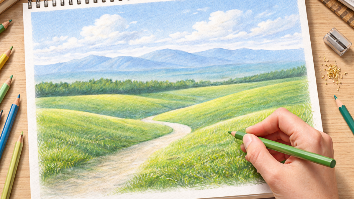
Landscapes are funny. For the first part of the drawing, it can feel like nothing is happening. You have light lines, pale color, and a page that still looks unfinished. Then you add a few shadows, and suddenly it starts to look like an actual place.
That is the whole point of this tutorial. We are going to build a calm colored pencil landscape step by step, without rushing. If you are a beginner, this is a great one to practice layering. If you have drawn before, it is still relaxing and satisfying.
One quick note before we start. I slightly brightened the early photos so you can actually see the sketch and the first light layers. In real life, those first stages are even lighter.
What you will need
- Colored pencils (a small set works fine)
- White drawing paper (Bristol is great, but any thicker paper is fine)
- HB pencil and eraser
- Sharpener
Optional but nice:
- Tissue or blending stump
Time: 45 to 60 minutes
Skill level: Beginner friendly
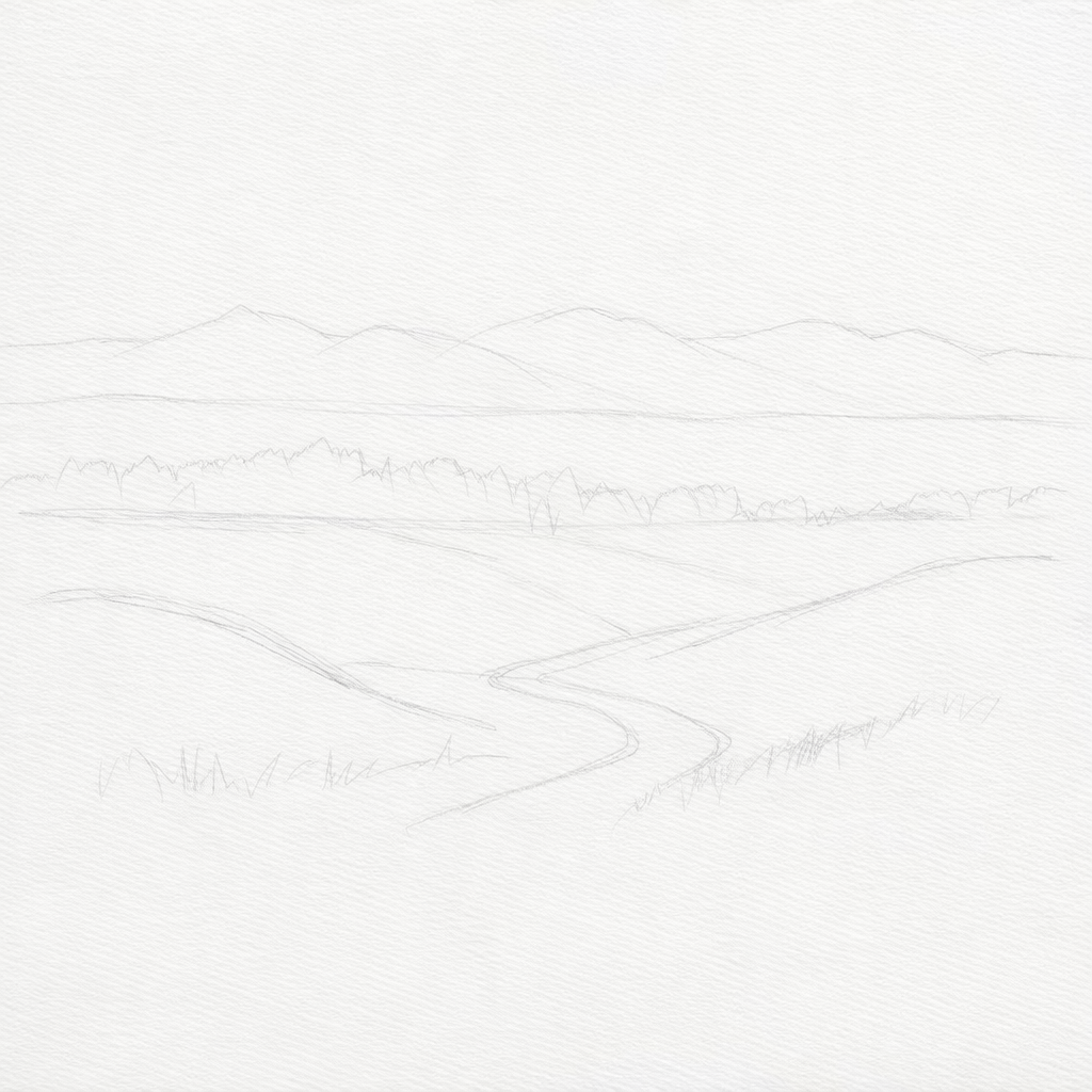
Step 1: Sketch the outline
Start with a light sketch. Keep your hand relaxed and your pencil pressure low. You want lines you can erase easily.
- Draw a simple horizon line.
- Add a distant mountain range using basic shapes.
- Sketch rolling hills in the foreground.
If your mountains look odd right now, that is normal. Mine usually do. They always look better once shading shows up.
Micro note: I redrew my mountains slightly bigger at this stage because they felt too small. If something feels off, fix it now. Later is harder.
Light pencil sketch of mountains and hills
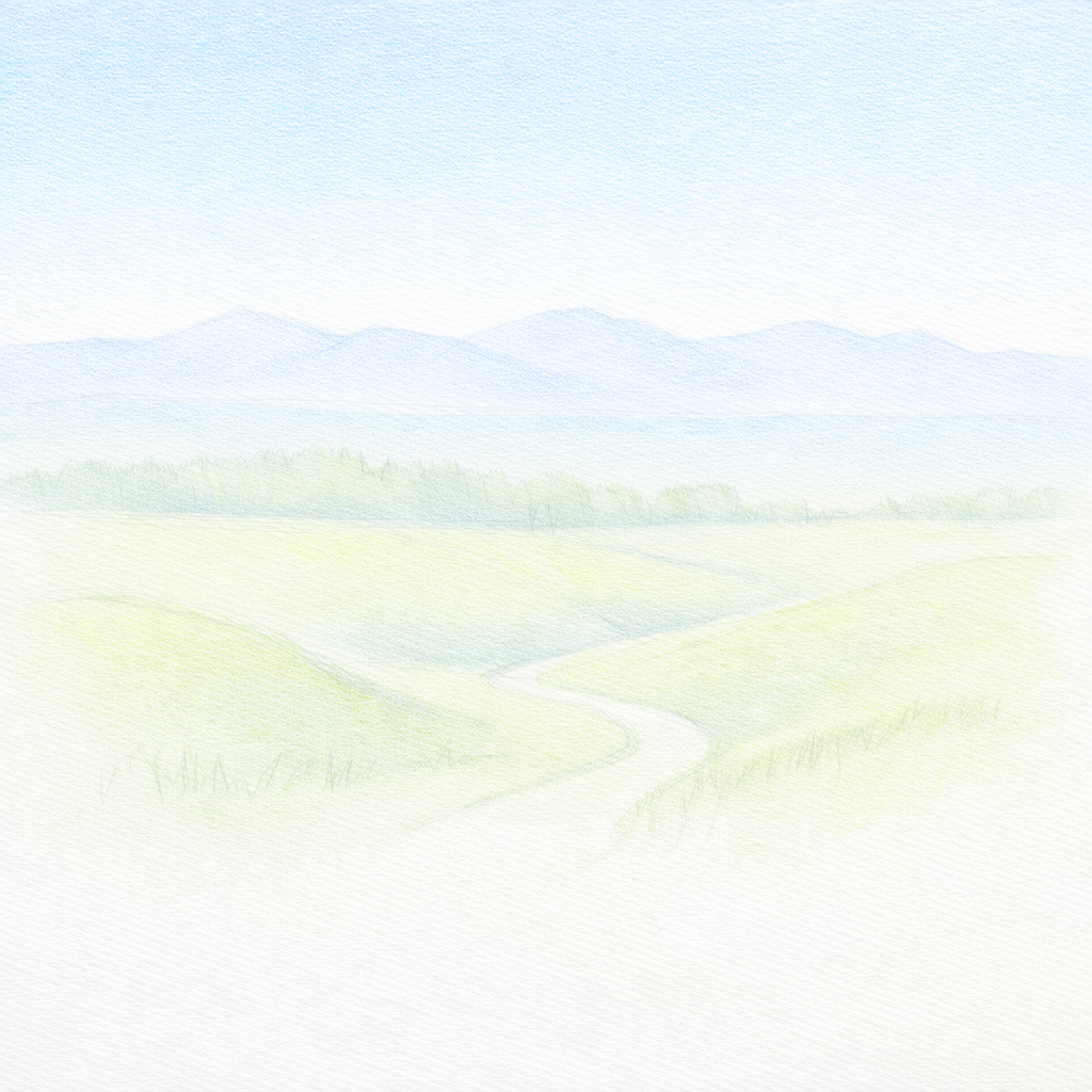
Step 2: Add base colors
Now we bring in the lightest color layers. Think soft and gentle. Nothing bold yet.
- Add a light blue sky. Make it lighter near the horizon.
- Lightly fill the mountains with pale blue or blue-gray.
- Tint the foreground hills with a light green base.
Try not to press hard here. Colored pencil builds best in layers. If you go too heavy too early, it gets harder to blend later.
Sky gradient and light base colors on mountains and hills
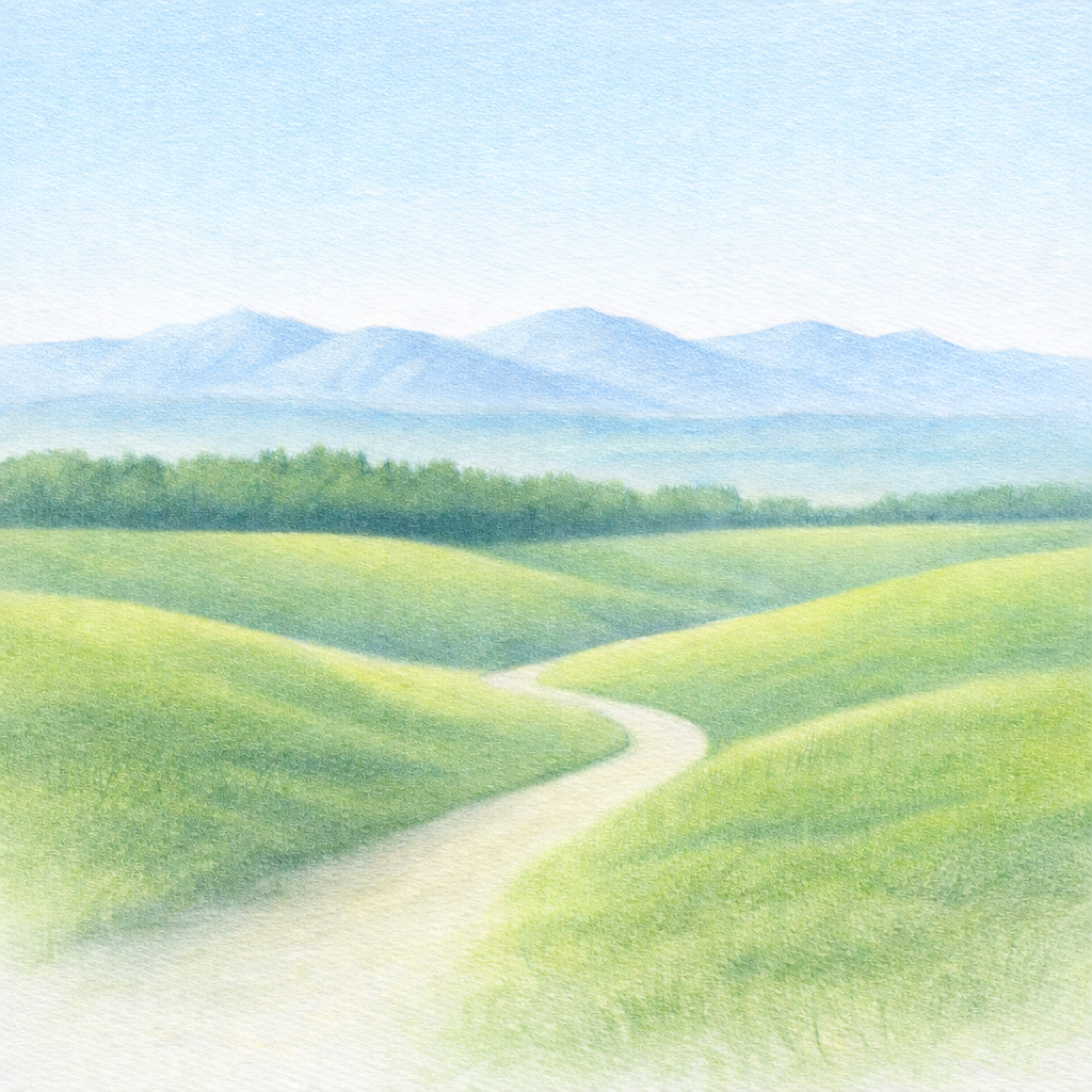
Step 3: Build up the layers
This is where the drawing starts to wake up a bit. We are still not doing details, just stronger color and clearer shapes.
- Add another layer to the sky to smooth the gradient.
- Deepen the mountain tones slightly, especially on one side.
- Add the midground tree line as one broad green shape. No individual trees yet.
If the tree line looks like a blob right now, that is perfect. It is supposed to. We will give it character later.
Stronger layers and a simple midground tree line shape
Step 4: Shade and blend
This is the step that usually pulls everything together. Depth comes from contrast, not from adding a hundred details.
- Add shadows on the mountains. Pick a light direction and stick to it.
- Darken the base of the tree line to make it feel dense.
- Shade the hills so they look rounded, not flat.
Micro note: This stage can look messy for a minute. Mine did too. Once the shadows settled in, the whole scene suddenly made sense.
Added shadows and blending to create depth

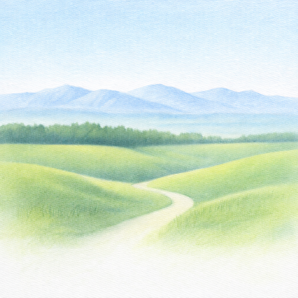
Step 5: Add details
Now you can start making it feel like a real landscape.
- Add grass texture with short strokes that follow the curve of the hills.
- Add small color variation in the hills. Warmer yellow-green in the light, cooler green in the shade.
- Add hints of tree texture without outlining every tree.
If you want an easy focal point, add a simple path or a soft edge line in the foreground. It gives the eye somewhere to travel.
Grass texture, small variations, and light tree detail
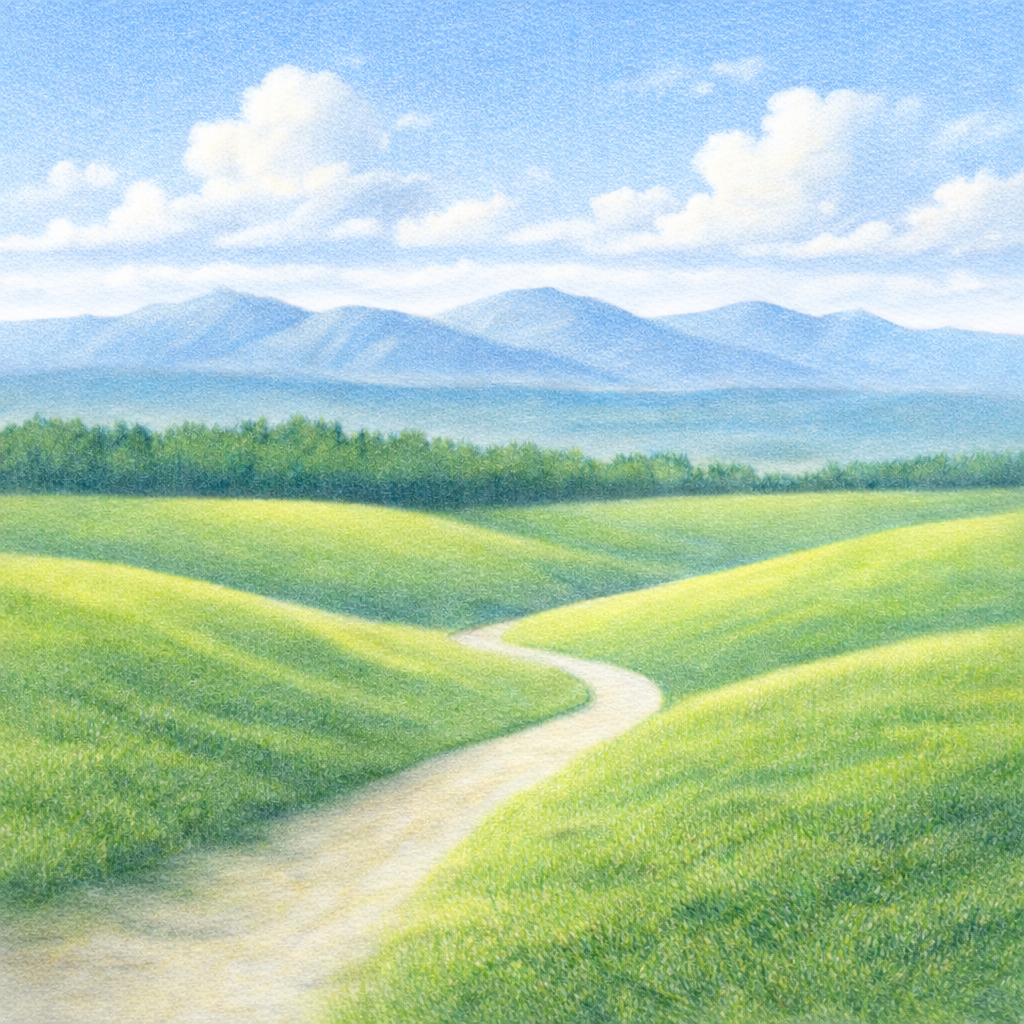
Step 6: Final highlights
This is the finishing step. Small changes here make the drawing look complete.
- Brighten highlights on the hills. Light pressure works best.
- Add a few soft clouds if you want. Keep them gentle so they do not steal attention.
- Sharpen one or two focal edges, like the path or a hill ridge.
If your drawing still feels a little flat, here is a quick fix. Increase contrast just in the tree line. One darker pass there often makes everything pop.
Final highlights, clouds, and finished landscape
A few quick tips that help a lot
- Use light pressure early. Save heavy pressure for the end.
- Keep distant objects lighter and less detailed.
- Layer the same color again instead of pressing harder.
- Step back once in a while. It is easier to spot what the drawing needs when you are not right on top of it.
You are done. And if yours looks different than the photos, that is a win. That means you made it your own.